YouSee Film & Tv - Synopsis I - Above the Fold
What?
The synopsis is the details page of any show, film, or series on YouSee Film & Tv. This is the page you go to, to find all available details about a title. On the synopsis, we also have a deep link to IMDb where you can find even more information about a film or series, without leaving the app
Summary
As the biggest streaming service on the market in Denmark (at the time at least), we offer many content types with different feature sets, metadata and business agreements. We are having the role of an aggregator providing many other Streaming Services within our universe.
Our content consists of Films, Series, and TV - and is ingested from the different provides such as TV-Stations, Streaming Services, and also our in-house production.
This content makes up over 30 different types of the synopsis, and the main goal is to develop a UI eco-system that serves the user a unified experience across all our content types and platforms.
And secondly, we were in the need to update our design, and codebases in order to refactor and optimize - and stay relevant.
Design Process
Go through user flows.
Research of competitors. Find out what they do good.
Ideation and prototyping.
Continuously coordinate with product owner and programmers.
Research Notes
It seems that much is standardized now in the streaming industry and one product looks a lot like the other. That is why the experience is more important than ever and should be fluid and easy to use.
On top of all the necessary features such as play and stop, you can always expand with new innovative features that give you the edge over the competitors but the boundary between standard and innovation is also constantly shifting where innovational features suddenly become standard.
An example of that is the optional subtitles or subtitles in more languages which a few years ago were not standard but are today, mostly because of Netflix. It can seem trivial to provide such a feature, but it actually is a huge task meaning that every piece of video needs to be re-transcoded because the subtitles are burned into the image and can not be removed without creating a new video.
Having more new and relevant features available helps maintain the users attention and serving the perception of a cool product that cares about the user and wants to help achieve the best experience possible.
When creating the structure of the synopsis we wanted to get rid of the "dead-end" navigation, where you go back and forth all the time. The new approach always provides more (and similar) content and is leading you to explorer the next great movie from within the synopsis.
In the perfect setup, we are using genres, sub-genres, ratings, actors, user preferences and AI to serve more relevant content to the user - and in the near future realistic setup, we are using genres, if we’re lucky.
By providing clickable tags with actors, directors and genres we ensure that the user always can dig deeper and see all content within that parameter.
Goals with the new designs are
To make it easier for our users to find the content they want to watch.
Create a visual hierarchy of elements that makes sense
Use one page for a program series instead of one for each episode
Implementing more data and being more transparent
Deal with inconsistent metadata
Defining and showing Primary Actions to get rid of over-cluttered UI
Be visual and display big pictures
Unified experience across all content types
My Role
Desktop Research
Prototyping
Concept
Design
The current Synopsis was created in 2016 (by me) and it has a different structure and other design goals. It works fine UX-wise, but the experience needed an update.
Call to Actions
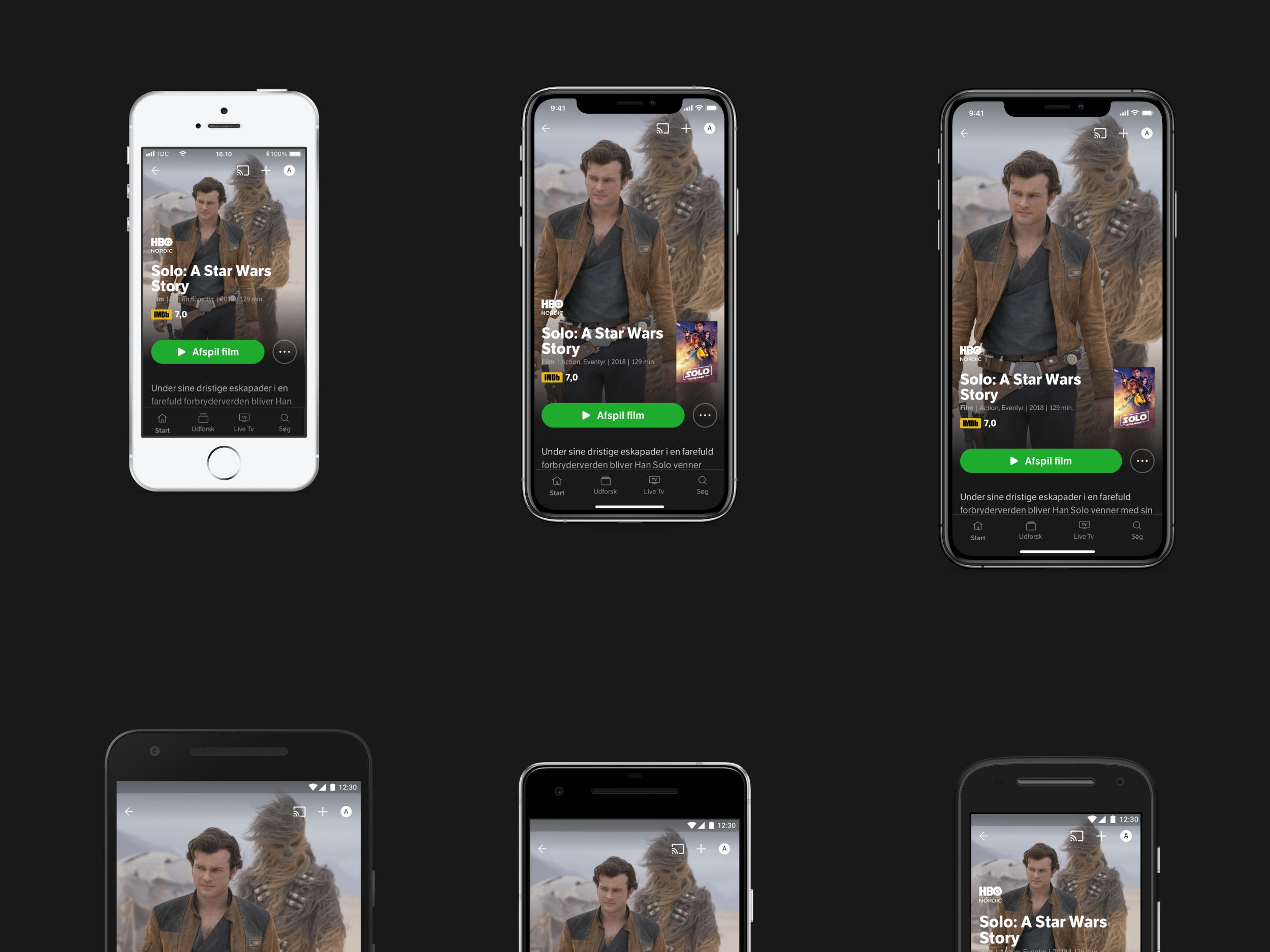
First, we set out to define the Call To Actions. The layout “above the fold” and with a Mobile-First approach. When offering various features for different types of content - due to the content itself and due to types of subscriptions - we needed to create a system that was flexible in relation to our feature set, and also future-proof for new and emerging features.
What is the primary action on the synopsis and what is secondary? The idea was to try and define what you need 95% of the time and highlight that. Most of the secondary actions would then become more shy in their appearance, but with the satellite buttons (located at the top), it appeared not to be is a problem. This was a way to streamline how many buttons are shown in the UI instead of showing all buttons all the time and clutter the interface.
We created a spreadsheet with all the CTA's, defined the primary’s and started created the first iterations of the UI. User testing was done on how the secondary actions were perceived - now hidden in a “Meatballs“ menu - and surprisingly it went very well. So we went on with designing all the states of the Synopsis.
Broadly talking, with this new approach we only have two CTA above the fold, a primary and a secondary. Hierarchy is key and the idea is that when you scroll down you can find much more secondary data and episodes.
With the new solution, we were able to deliver the same experience across tv, film and series - when putting all secondary actions in the “meatball” menu.
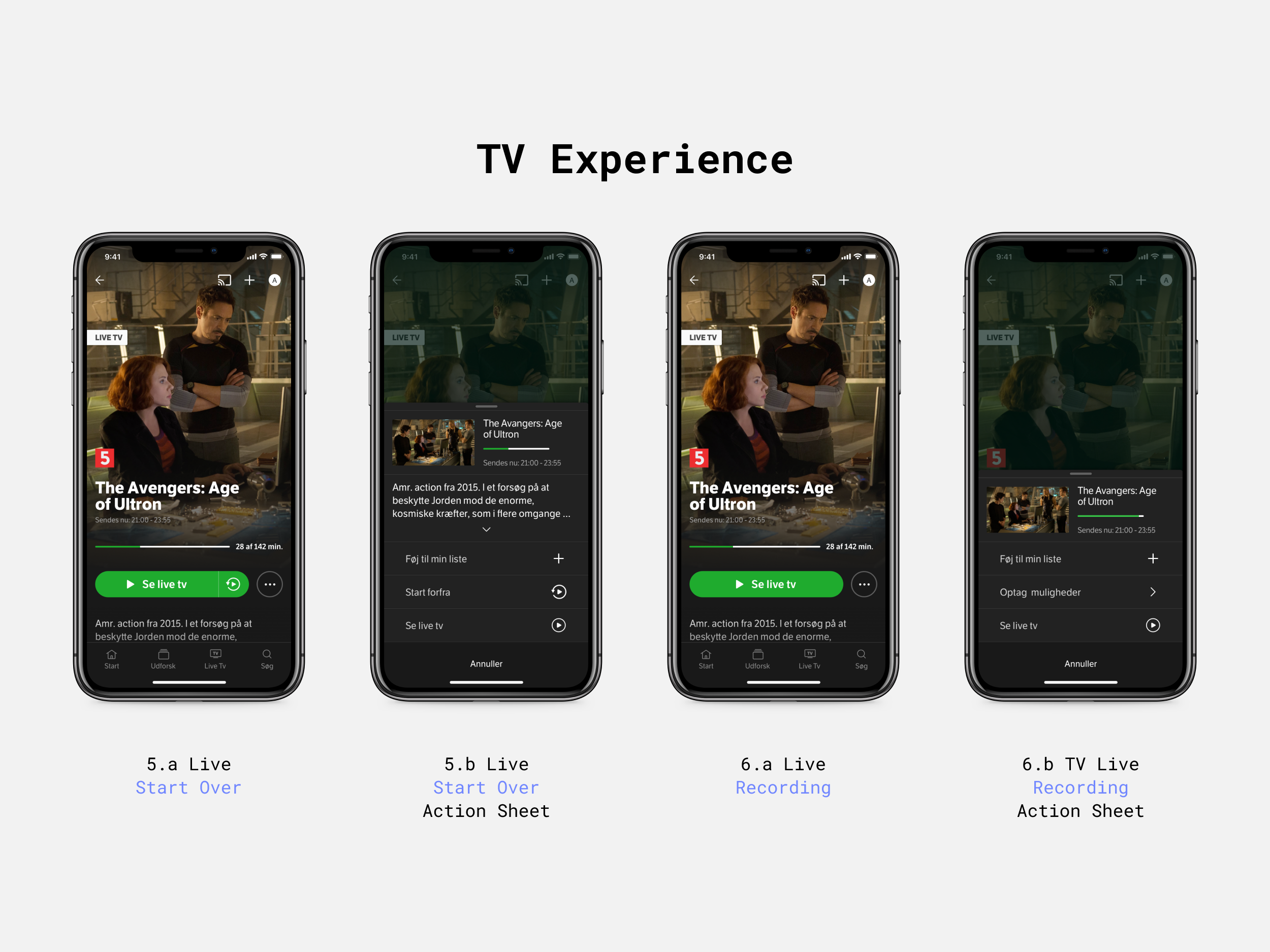
The Action Sheet
The idea behind the Action Sheet is to create a component that can be used not only in the synopsis but all over the app, a sort of “mini synopsis”. For instance on front pages long-pressing on a card or in the TV-guide when pressing a title. It functions as a “quick look“ when you don’t want to leave the current view and go to a new page.
The Action Sheet has a bigger purpose in the ecosystem than showing the “mini synopsis“. It is also used in other contexts with different layout and dialogue.
The information and metadata available fluctuate a lot. The description of a program can vary from being very short to be very long. The solution to that problem is to open the Action Sheet with a collapsed state of the description, only showing 3 lines. Now you have all features visible and with the option to expand the text to read the full description.
It is very important that each of the available features is shown in the action sheet, even if they appear elsewhere in the synopsis. We want to train the user to understand that the Action Sheet is the place to go to get the full overview of every feature available to this specific content.
Some have the opinion that CTA's only can appear once and only be shown in one place. This approach does away with that and shows CTA's when needed - even though it is in several places.
There is always a thumbnail and title at the top of the Action Sheet in order for you to know what you are reading about. This is an example of empathy towards the person on the other end! 😀

The Action Sheet always holds all features to an episode and description. It’s like a mini Synopsis in a modal window.
It took four iterations to get to this point. In that period we tried to get all the buttons placed in a manner that didn't look too messy. Taking into account that I wanted to meet the mobile guidelines on sizes of buttons. Especially on touch devices, it is very important that you can easily hit a button without having to first get your glasses then aim, and then press several times before you achieve the expected result.
With hundreds of takes, we explored the possibilities and combinations, but there was always some uncertainty about it - and what if we were to add a new feature like a sharing button? Oh shit! Now we had to start over again. It simply wasn't the long-lasting solution we hoped for.
Settling for Primary and Secondary Call to Action solution and hierarchy of the synopsis we could start creating all the different states and types of the synopsis - and these are shown below.
TV Experience
TV is the area containing the most business rules. For Instance how long aired content is kept as archive before expiring or if it is even kept as archive. Some channels support "Start Over" which allows you to restart a program and watch it from the start when it is playing live, and some channels don't.
If you have the YouSee TV Box you also have the recording feature, and with that, you can set a planned recording of a single program or an entire series with a few clicks. This also allows you to watch, delete and lock recorded shows on all your devices.
TV can both be a single show like a documentary or a film but also a series with lots of continuing episodes, in fact, on channels with a long archive period, it can worst case sometimes amount to more than 1000 episodes! Every TV station has its own rules and methods on how to deliver metadata, and we have to do a lot of data gymnastics to normalize these data into something we can use in our experience. Most popular shows such as the daily news never have any description where other shows have very long titles and popular sport live events tend to be really long, like “Fodbold: Champions League, Kvartfinale, Manchester City - Dortmund“
One provider has a rule about not being allowed to stream if you're not on your home network, and some foreign channels don't even have a synopsis 😲, only a live stream in the player, and there are more rules inside the player as well but will address these in the case of the player.


Series Experience
Normally when talking about series I guess many would think of drama series from HBO or DR - but more and more TV stations are also providing their reality shows and entertainment programs as on-demand series divided into seasons or years. It doesn't really change anything regarding how people are binge-watching one episode after another, but it is changing the perception of the term.
In series "continue watching" is especially important, and we are updating the backdrop of the synopsis based on the last bookmark in the player, telling us what season and episode you have reached - and the CTA button starts off where you left. In this way, the synopsis is always updated according to your latest activity.
It is pretty straight forward showing a chronological playlist for each season, but wanting to make it more visual than the old version we did add a thumbnail for each episode.
There is still room for improvement on a lot of stuff here, like showing content before is actually playable creating some hype and the joy of expectation, better genres, and having trailers available.


Film Experience
Films are providing the simplest synopsis of all because it's always a single show. It's true that some films are part of a series like "Harry Potter" or "Lord of the Rings" but in that case, these other films would have to appear in the section of Related Content - and not appearing like an episodes list.
On film, you also have the option to rent.


Bland Selv Experience
Bland Selv is a feature that allows you to mix and replace TV channels and streaming services every month based on points available in your subscription. The more expensive the subscription, the more points you have, and the more channels and streaming services you can have at once.
The vision for a new version of this feature requires an open universe where everything is open and available to be explored via the synopsis - but you will not able to play content if you haven't added it via Bland Selv.


More Experience and varients


Design Notes
There are a few special things about the new layout. Usually, you will start from the top and work your way down - but with the new design, the layout starts from the bottom and works its way up! This means no matter what type and size of phone or tablet you have, the CTA buttons will always be placed at the same distance from the bottom.
It also means that long titles that go into several lines grow upwards and the more elements used the more the screen is filled up. The descriptive text below the CTA fades out behind a gradient. This is a visual language that tells the user that there is more under the fold - and this entices you to scroll down and read the text and explore what else is hiding down there.
Interactions
Action Sheet overlay opens in a modal window style where you can close by clicking outside in the dimmed area. When you expand text the Action Sheet maximizes in size and if needed content gets scrollable.
When you start scrolling down, the background is animated a bit larger, creating a small parallax effect and making the user interface more vivid.
In this process, the backdrop image is gradually toned down. When doing this, it is much better to explore and see the content on top of the image, but at the same time, you can always sense it below the content. This creates an experience solely based on the content, and it makes each synopsis unique.
When you have moved a good amount of distance down the page and the title has disappeared out of view, I have added a small sticky header that shows the title of the show at the top. If the title too long and cannot fit into the area of the header, the idea is to use a marquee to animate the title.
Everything is reversed when moving back up to the start position.
Mobile First - Then Bigger Screens
Throughout the process, we have continuously tested whether the concept would work on larger screens and what it would look like. It is possible to make some changes for larger screens in the future, but for this first version - here and now - the same rules can easily work on bigger screens.